June 28, 2022 WILDE NEWS
What Is The 2022 Colour Of The Year And Why Is It Important?
The announcement of colour of the year is always a highly anticipated and exciting time for the art and design community.
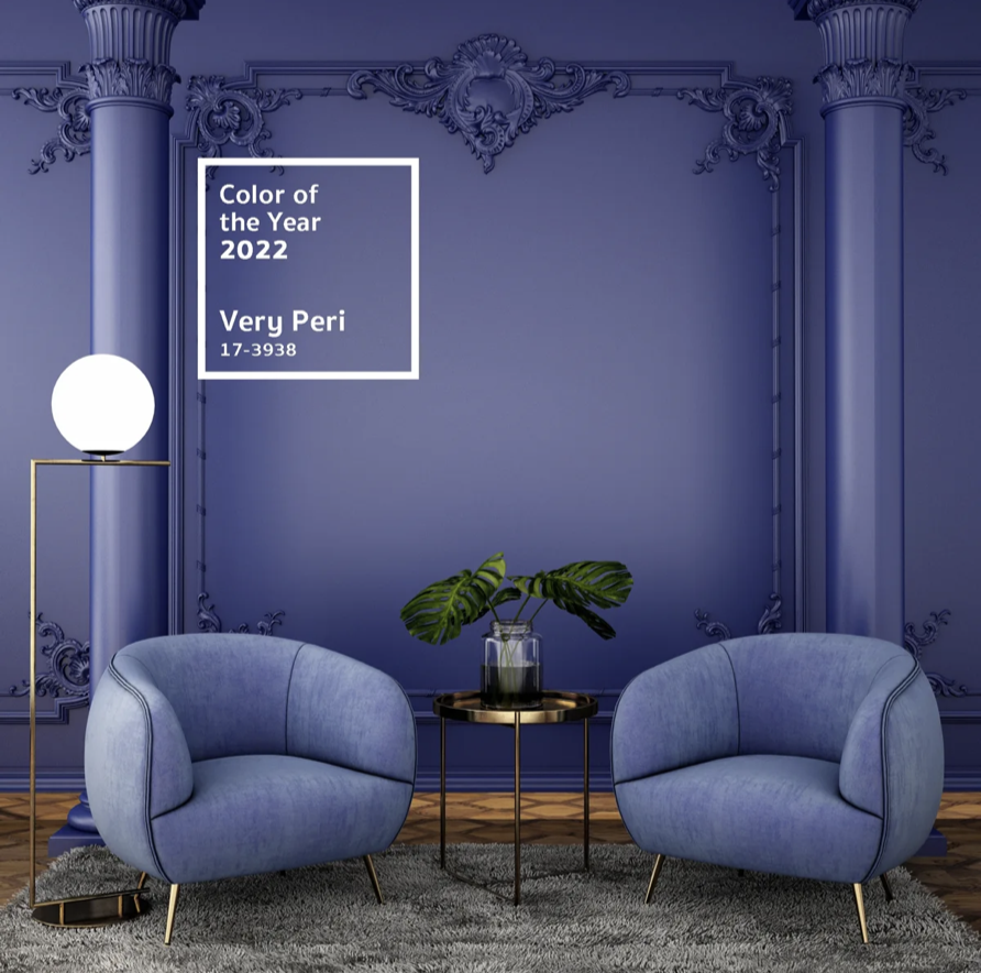
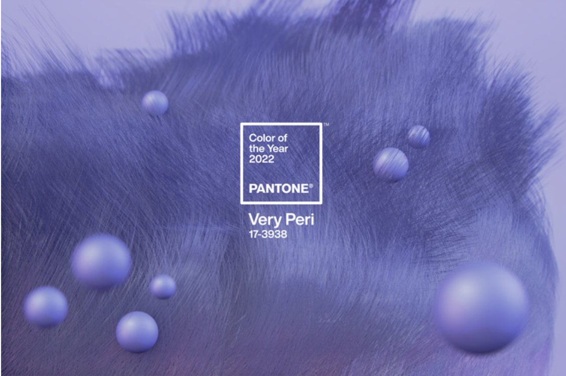
Pantone are an American colour company who each year endorse a shade which they believe will be popularly used in the upcoming year. For 2022, the colour of the year was named Pantone 17-3938 Very Peri.
“As we move into a world of unprecedented change, the selection of PANTONE 17-3938 Very Peri brings a novel perspective and vision of the trusted and beloved blue colour family, encompassing the qualities of the blues, yet at the same time with its violet red undertone, PANTONE 17-3938 Very Peri displays a spritely, joyous attitude and dynamic presence that encourages courageous creativity and imaginative expressions.” – LeatriceEisemen, executive director of the Pantone colour institute.
In the past the colour of the year has been an already existing colour chosen from Pantone’s extensive colour selection. However for 2022 they decided to switch it up a little. This year the colour reveal happened on December 8th in New York via an immersive art event at ArtTech House and Very Peri marks the first time a colour has been created specifically for Pantone’s colour of the year designation.
What Is Very Peri?
Pantone describes Very Peri as the “happiest and warmest of all the blue hues”. For Interiors they say Very Peri is capable of “injecting a sense of playful freshness” into homes and spaces. More specifically when used in unusual combinations, such as applying to varied textures and finishes.
“The Pantone Colour of the Year reflects what is taking place in our global culture, expressing what people are looking for that colour can hope to answer” – Pantone Colour Institute vice president Laurie Pressman
According to Pantone, Very Peri promises to bring “newness” to the year ahead. The fresh start which we could definitely all use after the past few years of uncertainty. In Style’s Lisa Stardust claims that Very Peri gives off inspiration and is motivational in nature, providing the confidence needed to align our goals with our emotions. Exactly the energy we need in order to bring our dreams to life in 2022.
Very Peri will be the colour which gives you that push to attract the energy and life you want, meaning that having it throughout your home will definitely be beneficial.
Very Peri And Interior Design.
The selection of colour of the year is no doubt a long and thoughtful process. It requires extensive consideration and trend analysis. But how is this helpful in interior design? Well, for 23 years, Pantone’s colour of the year has had major influences on product development and purchasing choices in a selection of industries. These include, fashion, home furnishings and industrial design.
Very Peri is a joyful futuristic shade. A perfect blend of blue and red, an ideal candidate to incorporate into future interior design projects. The apartment of Harry Nuriev, Crosby Studio founder, is the picture perfect representation of how to use Very Peri.
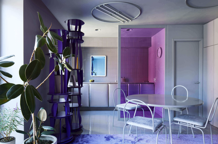
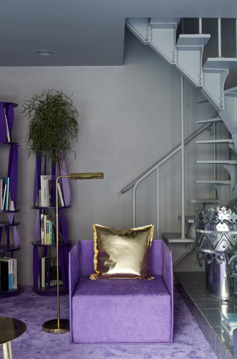
His futuristic home captures the modern and bold narrative Very Peri exudes. Very Peri is great for providing an eye-catching pop of colour whether it be through a painted wall or accent furniture.
It’s understandable that Pantone’s colour of the year may be a brave choice for some. Especially those nervous to redecorate and who usually remain generally in favour of a neutral interior. Despite this, Very Peri represents the transition period into digital reality.
What do you think of Pantone’s colour of the year Very Peri for 2022? Would you take the plunge into Very Peri for your home interior?
If renovating your home is something you’re eager to do but don’t know where to start, get in touch and let’s talk to see how we could help you…